
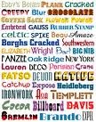
Typography
There are certain things that you want to consider when selecting fonts. First : How easy is the font to read on 9 point body text through 72 point display text? Don't use it if it isn't readable. Second: How well does it match the targeted publics? Third: How well does the font visually reinforce the key message? Some messages are best reinforced by specialized fonts. If you believe yours is, then don't limit yourself to classic fonts. Fourth: Experiment with adapting fonts for heads , logotypes and other display purposes.
Although , selecting fonts is very important; font size is as well. The two publications i am very familiar with is the business card and the brochure. When selecting the size for a business card , you should use 8 point font and the company name should be one font size bigger. When deciding the font size for a brochure , you should use 14 for the headers and sub-headings and 12 for the rest of the text. These are very key things to remember because if the font size is too big , things get clustered, and if they are too small people cant read them as well.
There are many places you can go to get free and legal fonts . In my Public Relations Publications class i have learned many places to get fonts. I have even found a video in which i want to share with you on how to get free and legal fonts. He even tells you some places where you can get fonts. The place he is getting is fonts from on the video is dafont.com. Enjoy the video!! http://www.youtube.com/watch?v=CYs3mdPcIUg
All information in this blog today is credited to Strategic Publications, Designing for Target Publics written by Linda P. Morton ( my textbook) .I hope all this information is a big help for you !......

No comments:
Post a Comment